Setting up dark mode with tailwind
The dark mode is a popular feature in websites and apps because it provides several benefits to users. Some of the main reasons why dark mode is a good feature include:
- Improved readability: Dark mode can make text and other elements on a website more legible and easier to read, especially in low-light environments. This can be especially beneficial for users with visual impairments.
- Reduced eye strain: Prolonged exposure to bright screens can cause eye strain and fatigue. Dark mode can help reduce the amount of blue light emitted by screens, making it easier for the eyes for users to read or work for longer periods of time.
- Increased battery life: Dark mode can help conserve energy and increase the battery life of devices, especially those with OLED or AMOLED screens. Since the pixels in these screens don’t need to produce as much light to display dark colors, using dark mode can significantly reduce power consumption.
- Personalization: Many people prefer the aesthetic of dark mode and find it more visually appealing. Allowing users to switch to dark mode can provide a more personalized and enjoyable experience.
- Accessibility: Dark mode is also useful for people with visual impairments and can make it easier to read and use websites and applications.
- Branding: Dark mode can be used as a branding element, some specific niches like music, game, and programming have a preference for dark mode, and it can be used as a way to stand out and create a unique and memorable user experience.
Overall, dark mode is a good feature in websites as it offers users a variety of benefits, including improved readability, reduced eye strain, increased battery life, personalization, and accessibility.
How to set it up:
1. Add the following code to the tailwind.config.js
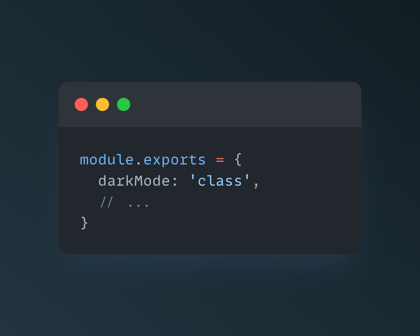
Setting darkMode: ‘class’ will enable the generation of CSS class-based dark mode variants. This means that when you build your project with Tailwind, it will generate CSS classes for each utility class that has a .dark prefix. For example, if you have a utility class for setting text color to text-gray-800 , Tailwind will also generate a variant text-gray-800 dark:text-gray-100 that you can use to set the text color to when the dark class is added to the element. (This is useful since we use Javascript to toggle dark mode).
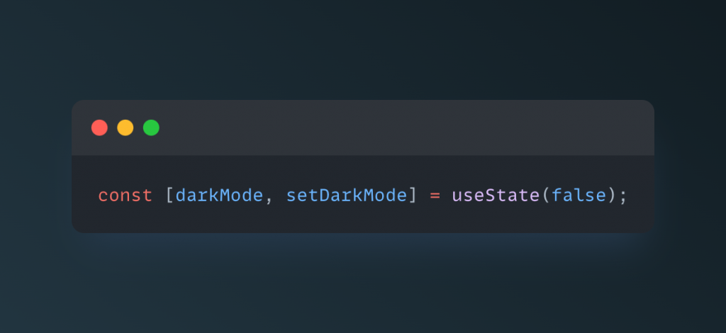
2. In your React component (or a ThemeProvider context), create a state variable darkMode to keep track of the current theme:
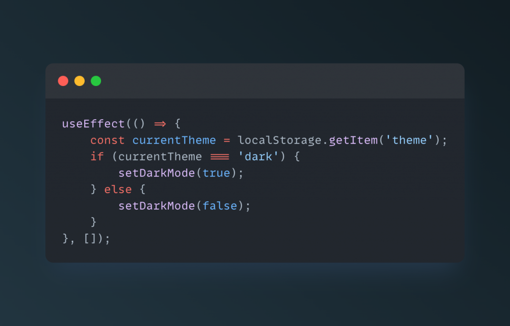
3. In your component’s componentDidMount lifecycle method, check the value of the darkMode state variable against the value stored in local storage, and set the state accordingly:
4. Create a function to toggle the theme by updating the darkMode state variable and storing the new value in local storage:
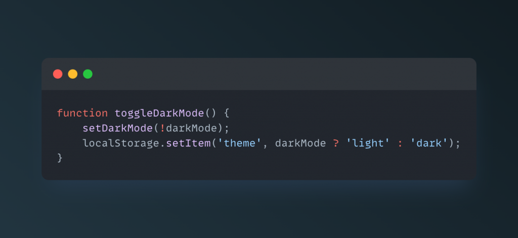
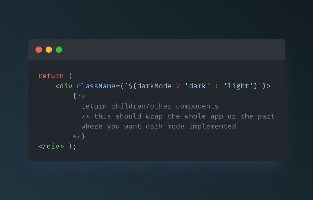
5. In your JSX, use the darkMode state variable to conditionally render a classname which will be used to apply the dark mode styles:
6. Create a button to toggle the theme and call the toggleDarkMode function on click:
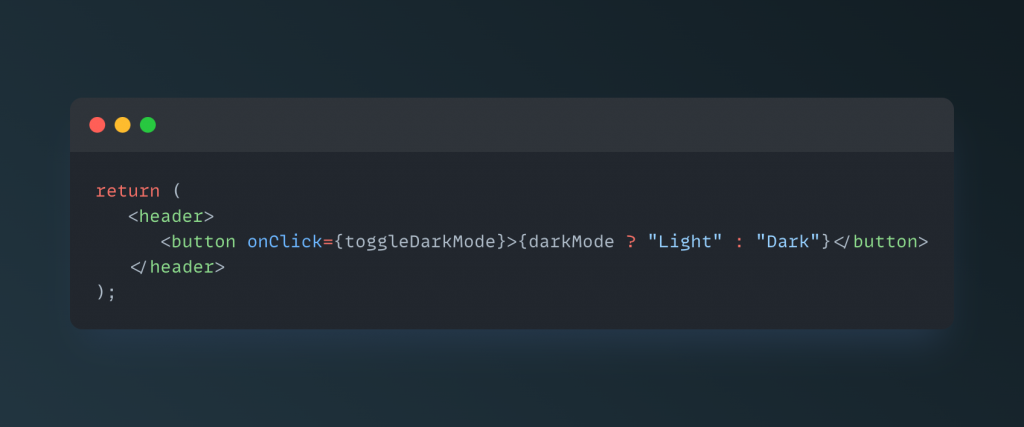
Now, when the component is first rendered, it will check the value stored in local storage to determine whether to render the dark class or not, and when the button is clicked, it will toggle the theme by updating the darkMode state variable and storing the new value in local storage.
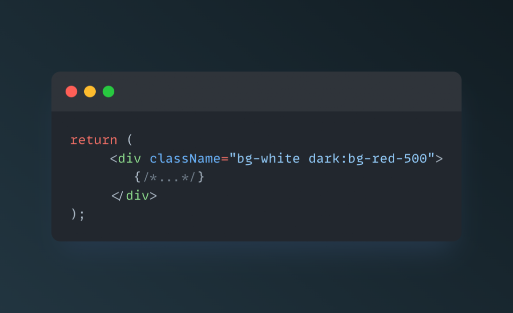
Usage example:
In conclusion, setting up dark mode with Tailwind CSS is a simple process that can provide a variety of benefits for your users. By following the steps outlined in this blog post, you can easily improve the readability, reduce eye strain, increase battery life, personalize the user experience, and make your website more accessible for all users. Implementing dark mode can also be a great branding tool and make your website stand out in specific niches. With Tailwind CSS, you can quickly and easily add dark mode to your website with minimal effort and provide a better experience for your users.