Creating a Donut-Shaped Progress Bar in Vue.js
Introduction:
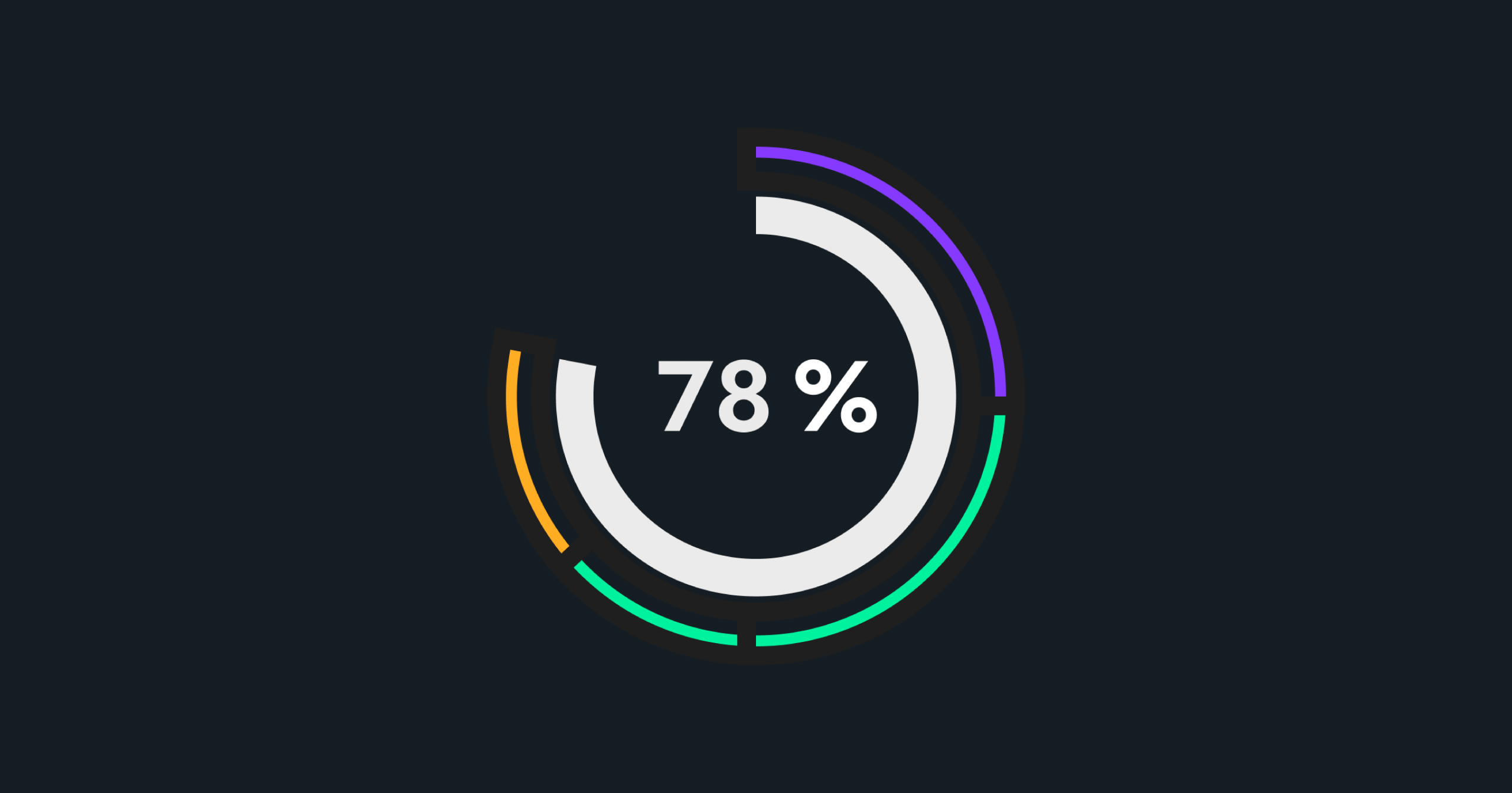
In this tutorial, we will learn how to create a donut shaped progress bar in Vue.js. Progress bars are commonly used to show the completion status of a task or to indicate the progress of an ongoing task. A donut-shaped progress bar is a unique and stylish way to display progress. In this tutorial, we will be using Vue.js and SVG to create a donut-shaped progress bar.
Step 1: Create a Vue.js component
The first step is to create a new Vue.js component. This component will contain the code for the donut-shaped progress bar. To create a new component in Vue.js, you need to create a .vue file. In this tutorial, we will name our component “DonutProgress.vue”.
Step 2: Define the template for the component
We use the template section of the component to define its structure and layout. Specifically, we utilize SVG to create the donut-shaped progress bar. As a result, the following is the template code:
<template>
  <div>
    <svg viewBox="0 0 40 40" width="40" height="40">
      <circle cx="20" cy="20" r="16" fill="transparent" stroke="gray" stroke-width="8" />
      <circle cx="20" cy="20" r="16" fill="transparent" stroke="#30efa6" stroke-width="8"
      :stroke-dasharray="circumference" :stroke-dashoffset="progressOffset" />
    </svg>
  </div>
</template>
In the template, we are creating two circles. The first circle is a gray circle that will serve as the background for the progress bar. The second circle is a green circle that will indicate the progress. We can define the size and position of the circles using the cx, cy, and r attributes and use the stroke attribute to specify the color of the circle and the stroke-width attribute to determine the width of the circle.
Step 3: Define the script for the component
We can define the logic for the component using the script section. In this case, we are using Vue.js’ computed properties to calculate the progress of the progress bar. The script code is as follows:
<script>
export default {
name: 'DonutProgress',
  props: {
    totalProgress: {
      type: Number,
      default: 100
    },
    progressCount: {
      type: Number,
      default: 0
    }
  },
  computed: {
    percentage() {
      return (this.progressCount / this.totalProgress) * 100;
    },
    circumference() {
      return 2 * Math.PI * 16;
    },
    progressOffset() {
      return this.circumference - (this.percentage / 100) * this.circumference + (1 - this.percentage / 100) * this.circumference;
    }
  }
};
</script>
In the script, we are defining two props: totalProgress and progressCount. These props are used to set the total progress and the current progress of the progress bar. We are also defining three computed properties: percentage, circumference, and progressOffset. The percentage computed property calculates the progress of the progress bar as a percentage. The circumference computed property calculates the circumference of the donut-shaped progress bar. The progressOffset computed property calculates the progress offset, which is used to display the progress of the progress bar.
Step 4: Define the style for the component
The style section of the component is used to define the style for the component. In this case, we are defining a transition effect for the progress bar. The style code is as follows:
<style scoped>
circle {
  transition: stroke-dashoffset 0.3s ease;
}
</style>
In the style, we are defining a transition effect for the circle element. The transition effect will make the progress bar smooth and animated.
Step 5: Use the component in your Vue.js application
Once the component is created, you can use it in your Vue.js application. To use the component, you need to import it in your main.js file. The code for importing the component is as follows:
import DonutProgress from './components/DonutProgress.vue'

new Vue({
  el: '#app',
  components: {
    DonutProgress
  }
})
In the main.js file, we are importing the DonutProgress component and registering it as a component in the Vue instance. Now, you can use the component in your HTML template by using the component tag. The code for using the component is as follows:
<template>
  <div>
    <DonutProgress :totalProgress="100" :progressCount="50"></DonutProgress>
  </div>
</template>
In the HTML template, we are using the DonutProgress component and setting the total progress to 100 and the progress count to 50. This will display a donut-shaped progress bar with 50% progress.
Conclusion
In conclusion, creating a donut-shaped progress bar in Vue.js is a great way to visually represent progress in a stylish and unique way. With the steps outlined in this tutorial, you should be able to easily build a custom progress bar that fits the specific needs of your project. If you have any questions or run into any issues, feel free to refer back to this tutorial for additional support.