Established in 2005, Çohu (Rise Up) is an organization whose mission is to limit the impact of political corruption on Kosovo’s public institutions. For more than a decade, Çohu was one of the key civil society organizations leading the anti-corruption efforts in Kosovo. Although the quality of its information never deteriorated, and the organization was gathering as much information as before, it soon became clear that the impact of its work was not being as effective as in the past.
For one, between the time of its establishment in 2005 and today, the way individuals consume information has changed drastically thanks to dramatic changes in the information-sharing platforms. Just as newspapers began making the leap from print to digital, many organizations, including Çohu, began to realize that in order to reach the audience and be effective in their work they have to adapt. For Çohu this meant that simple press releases issued once a month simply would not work any longer. Moreover, with the rise of new media, people became more receptive to news and information presented in different and more interactive ways.
Presenting complex data as text or tables can be unappealing at best, or incomprehensible at worst. Having realized that their information might leave their audience confused and ultimately uninformed, Çohu came to us looking for a solution that would make their information easily digestible, understandable and visually appealing.
Our Solution
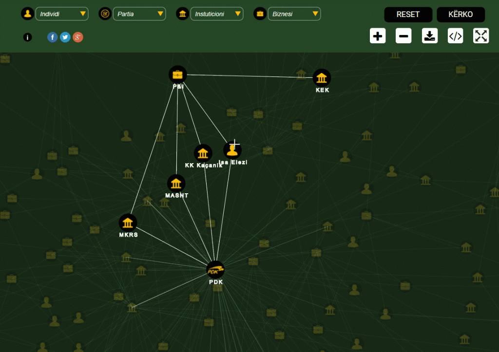
After the initial meeting it became clear that Çohu was looking for a way to make its information both understandable and appealing – they needed to visualize their data. The available data could show more than one story depending on the way they were related. For example, an individual within a certain political party or a business could have a corruptive impact in more than one public institution. Similarly, different political parties could be connected to different businesses and favoring them in open bids related to different public institutions.
In order to make these stories come to life on the users’ screen, we came up with a solution that allowed the user to connect the dots and see these stories emerge in front of them. But for the user to be able to see how different actors operate in a corruptive network with a single click, we had to find ways to first put all the relevant actors and institutions and make their interactions within the web visually accessible.
In addition, we worked closely with the client to automate the manual work that had been done by the organization up until that point, and made it possible for the staff at Çohu to import the data through a simple upload of existing excel files.
The solution provided to Çohu makes it possible for the information to be easily and quickly processes and filtered, as well as to generate graphs of different formats, including bars, pie charts etc., which can then be used as frames in other websites or as photographs to be attached to research reports or various written articles.
Combining our client’s knowledge and expertise with the solution provided by us proved successful as Çohu’s partners and its wider audience quickly embraced the new platform as a useful tool in their work against corruption.